
Kickoff Meeting
Gathered developers and designers to discuss design recommendations and develop a Fan (User) & Admin (User) Experience research plan. Developers agreed that a UX audit should be conducted and design recommendations should follow. Developers further walked me through a module demo and briefly introduced basic concepts to the proprietary CMS. Documented details and uploaded them to team site.
Exploratory Interviews
Conducted a exploratory interviews using a contextual inquiry method with YinzCam Director of Web Applications, Helpdesk Support Specialist, CMS UI Designer, and CMS Backend Developer in order to learn about system features, modules, and their design and implementations. Through these interviews (admin) user pain points were identified that informed UX priorities and pointed to larger design challenges that needed to be addressed. These interviews also uncovered opportunities to incorporate much needed functionality and next generation analytics. These inquiries informed stakeholders, developers, and designers about the current UX state of the proprietary content management system.


Expert Reviews
Conducted UX Expert Reviews with UI Designers and the Director of System Architecture in order to generate a detailed list of user experience issues within each module. Some of the areas of improvement included the following:
- System feedback consistency
- ‘Learnability’
- Interaction and visual design language
- Onboarding process
- Personalization
- Data visualizations
- Dashboard analytics including contextual data
Data Synthesis
After conducting contextual inquiries, user interviews, and expert reviews as part of the UX research plan, I worked closely with Nouf Aljowaysir to analyze the collected data identifying themes, patterns, and UX priorities. We synthesize the raw data into one spreadsheet and further refined it into a presentation for YinzCam's CEO, Priya Narasimhan. In order to facilitate the design phase of the project I created a taxonomy that helped prioritize UX and development work as follows:
- Ground veggies – issues that could easily be fixed with little effort and in less than a working day.
- Low hanging fruit – obvious issues that could be easily fixed and may have a visual or user interaction impact.
- High tree fruit – either obvious or implicit user experience issues that have a high impact on customers that should be addressed when time permits.
- Cloud candy – Aspirational nice-to-haves that may require extensive design and development but would provide a next-generation user experience.


Design Thinking
After the UX Research phase, I used the data to produce concrete designs based on educated assumptions about the user, all while remaining flexible and open to aspirational solutions. In order to accomplish this, I took an informal design thinking approach where sufficient time was spent on divergent thinking and ideation before converging on a CMS design solution. During this phase, all judgment and feasibility concerns were suspended in order to come up with different, and sometimes innovative, ways of meeting CMS user needs and expectations. Out of these activities wireframes and sketches drawn on whiteboards, paper, and ‘stickies’ were produced. In addition, I printed out inspiring UIs gathered from Pinterest, Dribbble, Squarespace and other public sites. I then posted them all around the walls of our workspace for quick reference while working. This design phase resulted in an initial idea of a holistic, end-to-end, user-centric CMS that reduced complexity potentially elevating the UX to the next tier.
Informed Design Phase
User flows, wireframes, Sketch designs and prototypes were iteratively developed informed by guerilla usability testing. The first ideation and user flows were on paper. I simply wanted to design the basic core functionality of specific modules. I found that a storyboard approach was very helpful and easy to draw out and follow. Once a basic user flow was designed, the actual UI design followed. I continued with low fidelity wireframes for several reasons. First, I wanted to prevent users and stakeholders alike from thinking that the designs were final, which is to say permanent, or difficult to change or modify. Second, I wanted to encourage critique, modifications and even 'do-overs.' Lastly, I wanted to make sure that color, icons, or any other aspects of visual design did not bog down developers and visual designers. The wireframes focused on functionality, features, information architecture, navigation and interaction design.

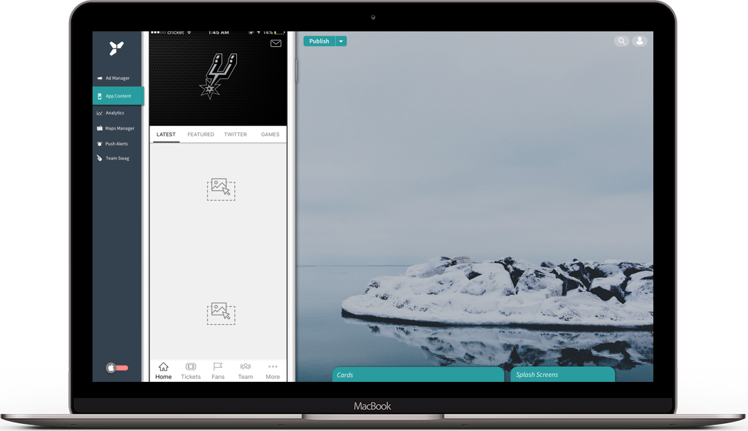
HTML Prototype
A basic HTML prototype* was created to demonstrate how the iPhone Content Editor would render in a browser and to further demonstrate the vision to developers and stakeholders.
*Only one basic itiration of the design is shown in order to respect proprietary information and functionality. All logos and sports images used are for illustrative purposes; no profit is being made in their use on this site. Please contact me if you do not have access to the prototype.
Documentation
Providing the team with the documented processes and steps to continue the design itirations we covered the following key flows and features:
- New Navigation paradigm (Feature)
- Single Card Creation w/ Onboarding (User Flow)
- Multiple Cards Creation (User Flow)
- Carousel Creation w/ Mutliple Cards Selected (User Flow)
- Carousel Creation w/ Single Card Selected (User Flow)
- Updating Splash Screens (User Flow)
- Preview & Publish (Feature)
- Theming CMS Platform (Feature)
- iOS and Android device visualization toggle (Feature)
- Tray mechanism for cards repository (Feature)
- Simulation of content on multiple devices (Feature)
- Onboarding experience (Feature)
In addition to the documentation and presentations provided to members of the team and CEO, I built a website TimelineJS complete with a table of contents and embedded links to local servers where access to the raw data as well as the data synthesis is available. I also included methodological explanations and references to both professional and academic sources for further reading. Lastly, I adumbrated future steps including the UX research and design framework to follow that I created out of existing models but tailored to YinzCam.


Design Anthropology
As a Design Anthropologist, I documented organizational discoveries that affect workflows, employee interactions, office culture, and other aspects. Taking a Design Anthropology approach forced me to peel back the layers of YinzCam design culture delving deep into the company’s organizational structure in order to discover root causes. I decided to do this because I wanted to understand, document, and create meaningful and lasting solutions, as well as build a framework that would contribute to taking YinzCam to the next UX maturity level.